Wrist Wars
With the annual CES craze upon us, it is already quite clear what the big play of the major tech brands is in 2015. Carrying over the beginning of wearable mania from 2014, this year will revolve all around pinning tiny computers on every imaginable body part. Eyes, ears, torso, feet, nothing is spared. And the epicentre of all this is the wrist. I guess the whole industry waits for the, now announced for some time, essential consumer acceptance test: The Apple Watch. Will it bring the ubiquitousness champions of the concept hope for? Surely the most prominent contender for precious, personal wrist-space, the Apple Watch is just but one entry amongst hundreds that make their way to market in 2015.
We currently see many approaches, ranging from pimped out traditional watches to entirely new categories of wrist decor. Basically, the topic is mostly examined from two ends of a spectrum, one departure being an iteration of traditional watch metaphors, the other coming from the ongoing miniaturisation of computers.
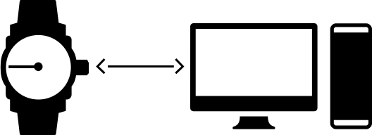
What is that thing on my arm? A watch, a mini computer? Something in between? Are they the same?
(watch icon by Jamie Rothwell, computer by Edward Boatman via The Noun Project )
While the core feature of traditional wrist watches has always been status communication and fashion sensibility, even more so in an age where the time-telling feature mostly moved over to smart-phones, the computer's identity is defined by functionality. These different perceptions make for quite a broad range of products for this relatively young field. What nearly all of them share though, to varying degrees, is the dependence on a smartphone.
Let's look at some wrist-bound approaches across the spectrum.
The Apple Watch
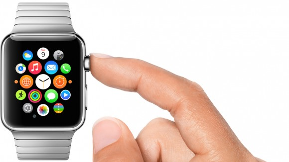
Promotional Image by Apple
As said before, this is the device the entire industry is waiting for, with the potential to validate the entire category. And it most purely represents the crossroads of traditional watch-making and personal computing as Jony Ive so eloquently and slowly explains in the introductory video. This device clearly takes the design cues from traditional watches being fashion accessories. Typically for Apple, the highly miniaturised state-of-the-art computer tech, should be nearly invisible to the wearer. It is the usage, not the spec, which defines this device. This design sensibility already made an impression, even before launch, as many others who previously offered rather band looking devices, get on the style bandwagon.
Virgin Media's KipstR
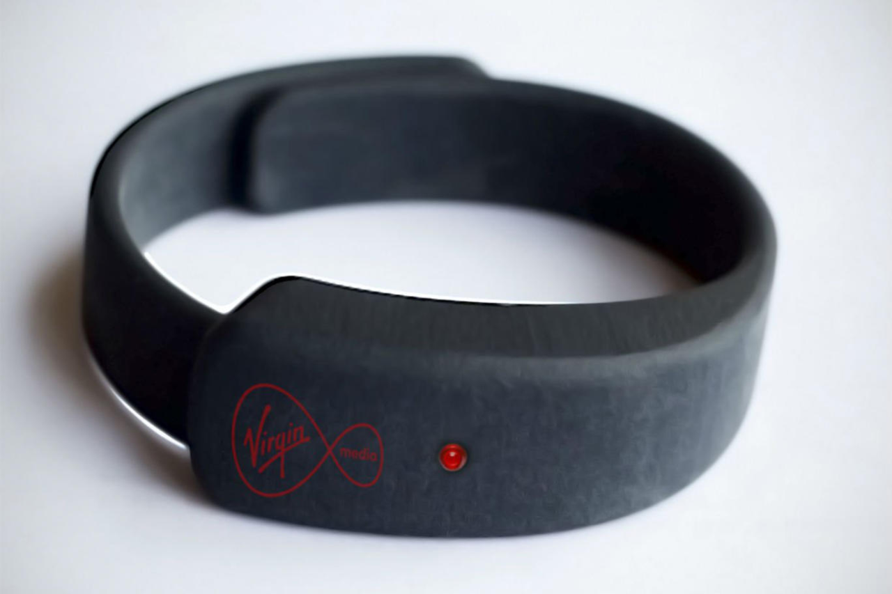
Promotional image by Virgin Media
The KipstR is a device, currently in a testing phase, which is reduced to a single purpose: To observe you falling asleep in front of the TV and then trigger a recording. Not entirely sure how serious this product really is, I included it to illustrate a point. Feature singularity has made a lot of mobile apps very successful. Remove the clutter and focus on one thing and make it perfect (actually one of Apple's mantras, too) is a valid approach. But, does it work for these kind of devices? While Smartphones can host a huge number of different single-purpose apps, the human wrist has pretty finite space to offer. Does this immediately imply, that we need a swiss-army knife of a wrist device, to handle all eventualities from fitness tracking to controlling the room's temperature? Or will the wearers behaviour change accordingly and always use the device, which is best fit for the task at hand? Well, maybe there is a market in Batman Style Utility Belts for wearables or we all end up like this guy.
The single-feature approach can be seen in some other products, like the Hyundai BlueLink Watch, which focusses on functionality for the car, or the First Alert One Link Watch, which hooks up to First Alert's security system.
Montblanc Timewalker Urban Speed e-Strap
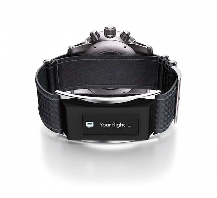
Promotional image by Montblanc
The Montblanc entry is the first foray into wearable tech for the luxury watch-maker and it is another interesting approach. Rather than dilute the core asset of a high-quality mechanical watch with digital components, they chose to use the wristband to augment the experience. This keeps both worlds intact and really plays to the strengths of each use case. Still a fashion piece at the core, this solution also offers smartphone notifications, activity tracking and control features on the wrist, though neatly tucked away in the personal space close to the body. To some this approach, not including the digital part with the main product, might seem as an after-market compromise and a quite cautious step into the realm of digital communication. But, this provides a good strategic position for Montblanc: The digital part can be updated independently from the watch and keep with the times and existing customers can retrofit their watch with the new e-Strap. Regarding this, other approaches in this area feel much more like a compromise of intrinsic usefulness and beauty, like the Martin Watches solution.
Moto 360 & Alcatel One Touch
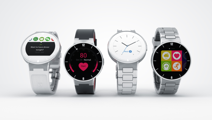
Promotional image by Alcatel
This class of watch devices takes the approach of completely digitising the watch, but keeping true to the traditional form factor of a round face. The decision to stay true to classic watch iconography immediately takes the computer connotation out of the equation. I'd argue that the technology, while front and center, is even more obscure here than with the Apple Watch. An added bonus for all the iPhone users, the Alcatel device is compatible with your favourite smartphone, while the Moto 360 uses Android Wear Software.
Alcatel promotional page
Moto 360 promotional page
Looksee Fashion Labs & Misfit Swarovski Shine

Promotional images by Looksee & Swarovski
While not technically watches, these two entries are very interesting in their own right. Both are without a doubt fashion accessories first and tech gadgets second. The LookSee band has a wraparound e-ink display, the Swarovski device not display at all. The thinking here seems to be, to rather subtly augment the original experience without compromising the aesthetics. Additionally these offerings target women, for whom the smartwatch market at this time is rather uninteresting with huge watches and a more masculine design throughout. But, this particular type of luxury accessory is not for everyone and I'd really like to see one of the big players tackle an elegant, yet fit for daily wear, watch for women soon.
After CES is before CES
This is just a short extract and narrow view on the wrist wars of 2015. There are so many devices with different form factors and target audiences launching this year, that it is hard to keep track but interesting to see which kinds of ideas will work and persist. And, maybe the wrist wars are over before they've really began. A lot of exciting, wearable devices bypass the wrist directly and focus on other ways of in- and output. A very promising idea, from the kickstart a while back until the launch now, are the Bragi Dash In-Ear Headphones. These wireless plugs track, measure, control and notify so elegantly and passively, while keeping an unobtrusive footprint, that there is real potential in adoption. Let's see what the year brings, but I see a more attractive and realistic vision in this than in this.

