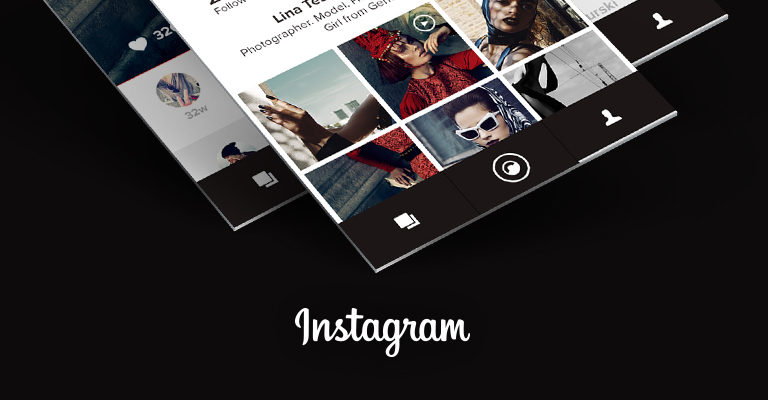
Rob and his Instagram
His suggestion is a new take on the interactive aspect of the Instagram app. And the result is more than impressive. As we had a few questions, we grabbed him for a little interview. Read for yourselves what he has to say about his work.
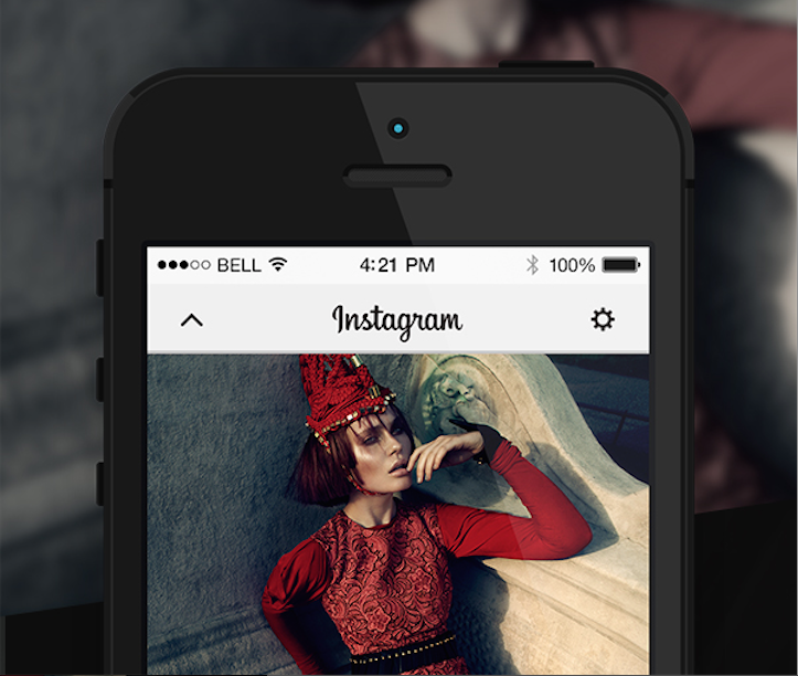
Hi Rob, why did you develop a new Instagram design in the first place?
For one reason only: when I'm using something on a daily basis and love the basic function of it, but see enormous potential for improvement, then it only stands to reason that I'm going to want to adapt it.
What was the biggest challenge for you?
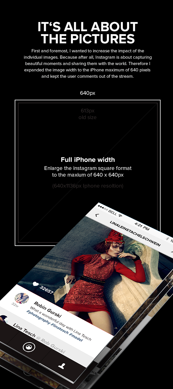
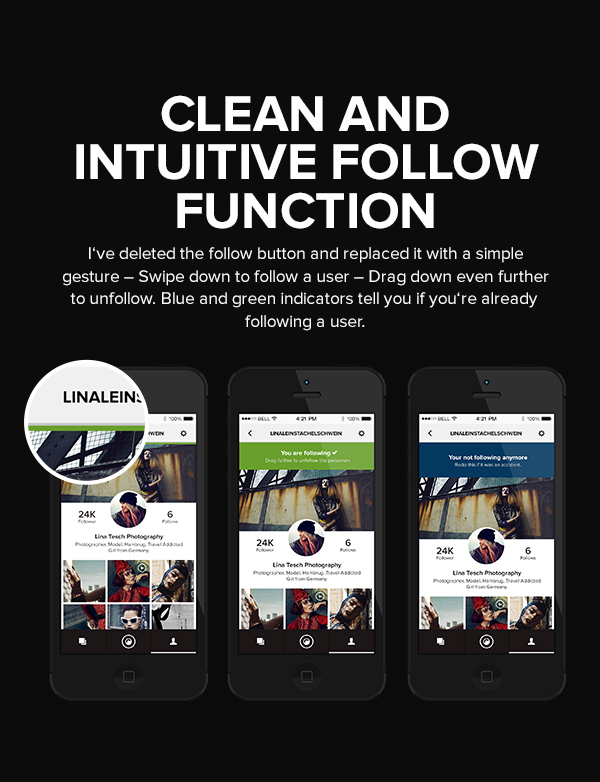
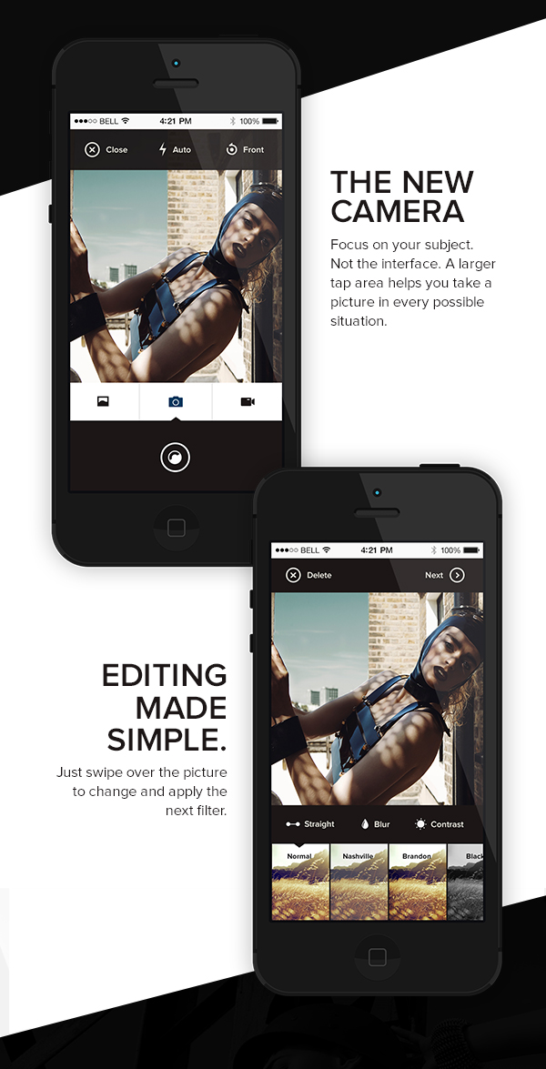
The improvement itself. Many redesigns are only about improving the appearance. My goal was to improve the app. To make the important functions stand out, and scale back less important ones.
So it's not only a "reskin", but an overhaul of the entire UX. How far did you go with the concept development?
I started out by first questioning every function and then classified them according to importance. For me the focus was definitely on the redesign of the user navigation, which in turn required adaptations in the design. It was important to me to optimise the functionality of the app and initiate new ways of looking at it. An example of this are the gestures on all touch devices, which in my opinion are often not incorporated into the UX enough. It rarely goes beyond a swipe-left to the menu or a swipe-down to scroll – there's a lot more potential there.
How much time did you spend on it?
As it was, and still is, a project I work on in addition to my day job, it's hard to speak in terms of working days, but roughly speaking I invested two evenings on the concept, one Saturday on the design and two evenings on the presentation. But before I began, I already knew which screws needed tightening in order to achieve the result I was aiming for.
Instagram has now initiated a redesign itself: do you believe they are following a trend that you also saw, or what chances do you think flat design will have?
Yes, around three weeks later an urgently necessary update came, but it was only reduced down to the UI and that's why I think it comes from the "IOS7 redesign wave". With this style they're certainly following a trend, but before the decision between flat design, skeuomorphism or similar styles is made – especially with applications – there should always be a focus on the actual function. And that is precisely where I see a big potential of flat design. Fewer distracting elements and details, more focus on the content and the function. However, the result of this also means higher expectations in terms of getting the right proportions and the suitable weighting of the elements. So I'm looking forward to seeing where this trend will take us in the near future.
Have you already received a lot of feedback about your work?
The first week was really interesting and I have to admit that during that time I probably opened the Behance app four times more than unusual and not even 10 minutes could go by without my display showing some kind of a notification. Encouragement like that is great of course and makes the work that I put into it even more worthwhile.
And has there been any criticism?
There's bound to have been – which pleases me, as it shows that people are really getting to grips with it and not just skimming over the case.
Apart from the redesign, you are using Behance for yourself as a platform. Why?
Behance offers an enormously well-developed platform for specialists of the most diverse disciplines and a comparably simple opportunity to make your work accessible to many people. For example, almost 8600 people have viewed this case so far and more than 800 have liked it. And I was all the more pleased when I got the e-mail that the case had been chosen as the "Featured Project" on "Behance App Design Served".
What project is next in the pipeline for you? Or was this just a one-off?
I'm planning to launch my portfolio at the end of the year, that's what's taking up most of my time right now. However, I still have quite a few other projects on my to-do list. But I don't know yet which order I'll tackle them in or when the next one will happen.
Great, thank you!
It was a pleasure.
