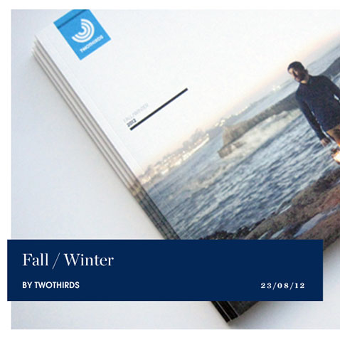
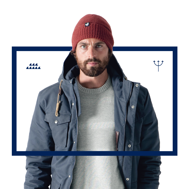
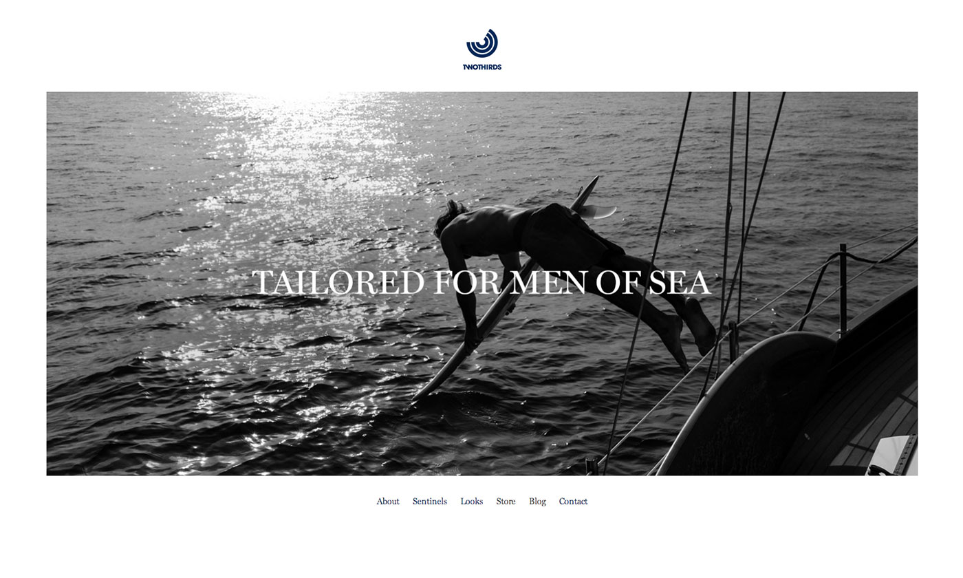
Tailored for men of sea
For the streetwear label Twothirds we designed a new website for the 2013 collection. As well as more flexible product descriptions, the aim of the new design was to shift the focus onto the social commitment aspect and to better convey the brand’s attitude.
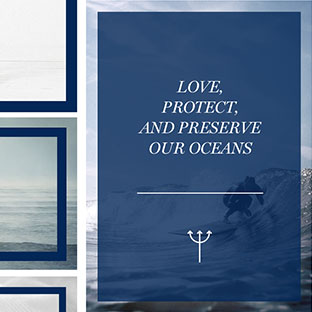
The blue company
Twothirds is showing that sustainability and taking responsibility for the environment doesn’t necessarily negate a sense of style and fashion. So it was our task to showcase the origins of the brand and its connection to the surfer community, just as much as to address the target group in a marketing-oriented manner.
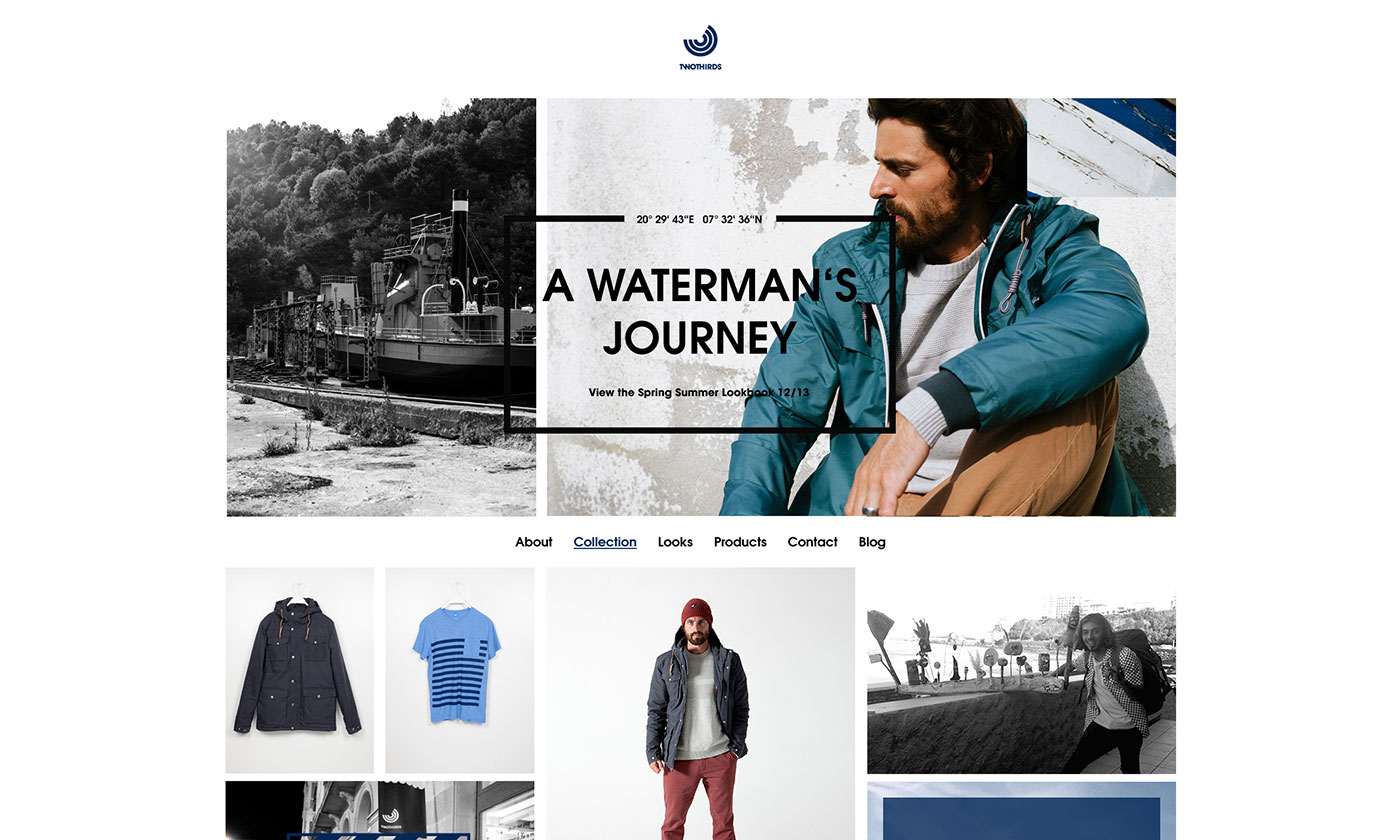
Design through content
So fashion brands can ensure the focus is on their seasonal collections, the overall design of their website should take more of a backseat. This is why we designed a layout that to a large extent talks to the audience through the pre-existing visual imagery.
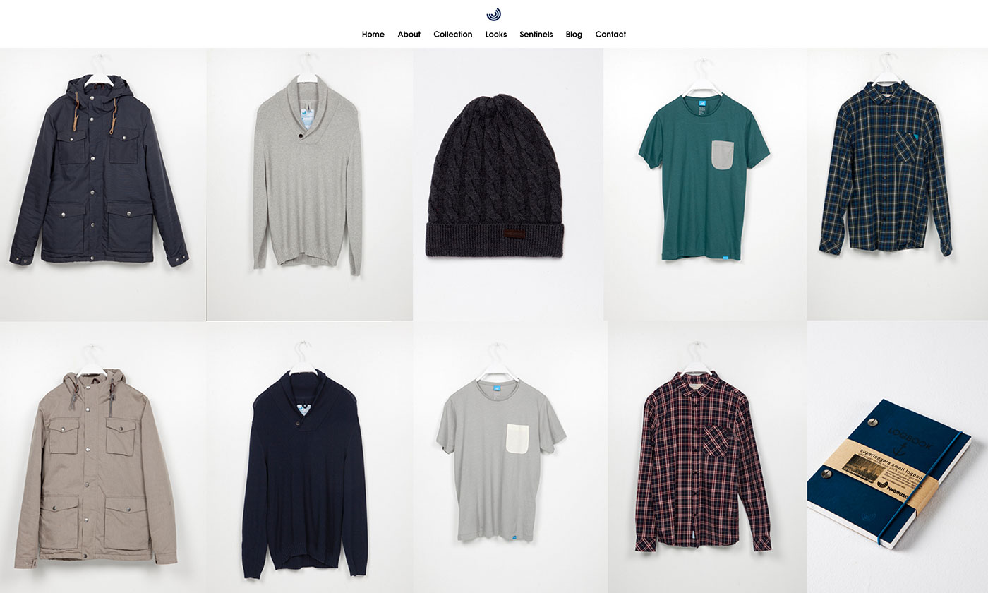
Multi-faceted world
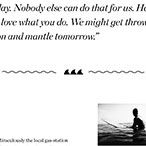
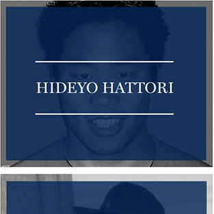
The website consists of a flexible grid, which integrates all communication components. Starting with the photos of the current collection, down to the brand contents and photos from the community and the blog posts.
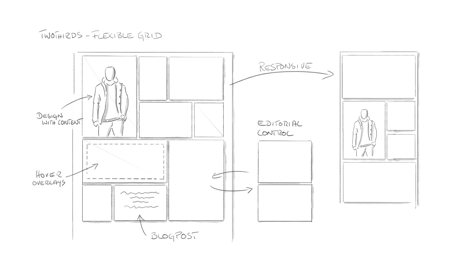
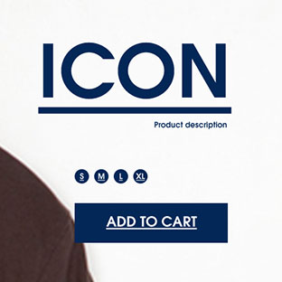
Minimal
We decided on a very light and clear design that shows the products and contents at their best. This happened in close consultation with the client, as this decision also had an influence on the later photographic concept.
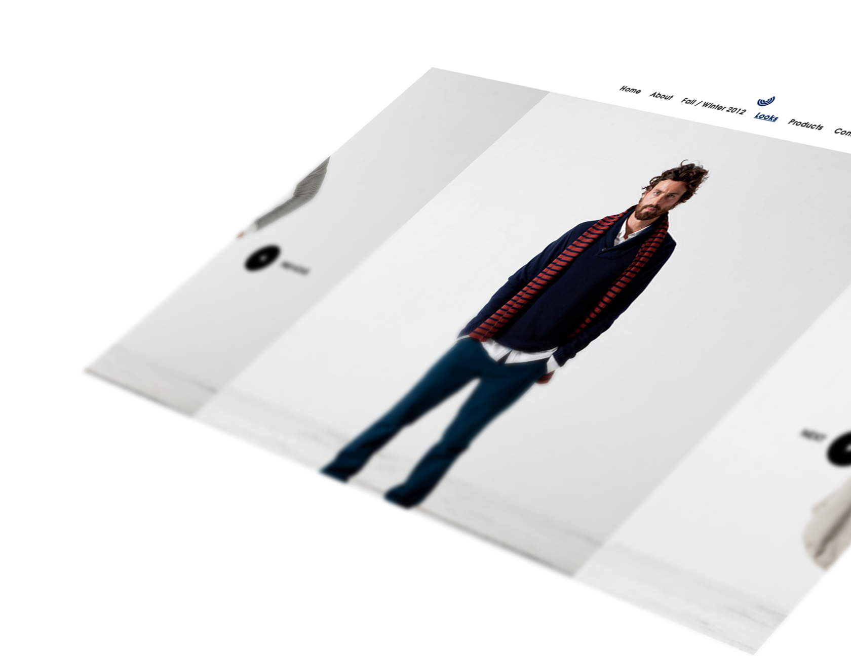
Responsive, transparent and fluid
The layout is designed to be adaptive and fluid, to ensure a consistent brand presence and user experience on all end devices. Individual graphics in the teasers were transparently set on a separate layer so the scaling could be set differently depending on the device.
Presentation of the collection
In addition to the website, we developed and produced a video that showcased the collection using photos with an ocean backdrop. We used a special image processing method, which enabled us to divide a photo into several layers of depth, thereby creating a parallax effect, which added movement and depth to the video.

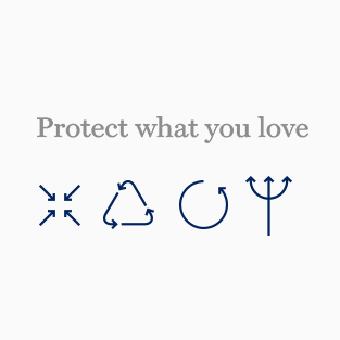
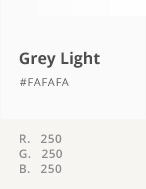
Ocean blue
To ensure the brand’s ‘ocean blue’ is the dominating colour in the layout, we decided not to use any secondary colours apart from grey tones for the design concept.
The finishing touches
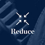
So the overall image didn’t look too monochrome due to using one single colour, we inserted a lot of elements that become visible only upon interaction, e.g. on mouse-over. The emotional images in the modules act as a counterweight to the simplified colour and icons, meaning the design stays straightforward without looking boring.