Wallspace AR
Working closely with tesa, we developed the first augmented reality (AR) glasses prototype, that supports consumers to hang picture arrangements on the wall. A first step toward moving beyond selling adhesive wall-hanging solutions as products, to products as services that solve bigger problems.
Developing a new AR service tool
tesa's Adhesive Nails are one of their most popular products. But there's a challenge: The installation of the product, which both holds reliably against walls and can be removed without leaving a trace, is not so trivial. One that not everybody has patience for. Of course, it comes with an instruction manual, but most people find it tricky to follow 2D sketches on a piece of paper while trying to solve a challenge in the space around them with both hands. Using a first of its kind prototype for AR-glasses, a product predicted to boom in the next few years, we digitally reinvented them. With instructions that are simple, interactive, intuitive, and, more importantly: three dimensional. The resulting experience became a unique case for tesa. And the starting point for a more comprehensive service.
From workshop to working AR prototype
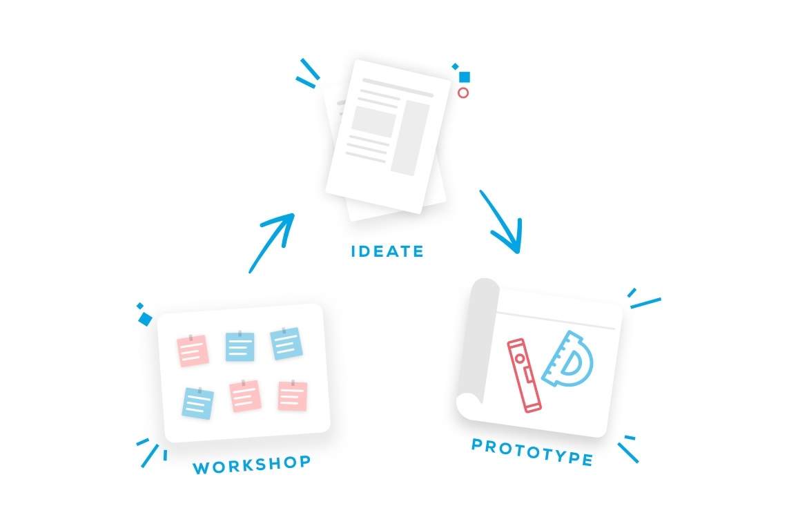
Although seemingly simple, the process behind it was much more complex. In an insight-generating and problem solving workshop, we generated lots of ideas for new services. Within this, we aligned on the most urgent task for the brand: solving that mounting problem. Using the unique capabilities offered by augmented reality glasses. But we knew the idea had potential for more than just a best-in-class instruction manual. The final product, “Wallspace AR”, was concepted as part of a complete ecosystem for the entire customer journey. From empowering the user to find the art they love, to creating the perfect room ambience, to finally hanging it to perfection using tesa products. After a few quick tech-tests for fast learnings, we got down to prototyping the concept’s MVP - developing the AR app for Magic Leap in a transparent, iterative process together with tesa.
The experience itself: No tools needed – except AR-Glasses
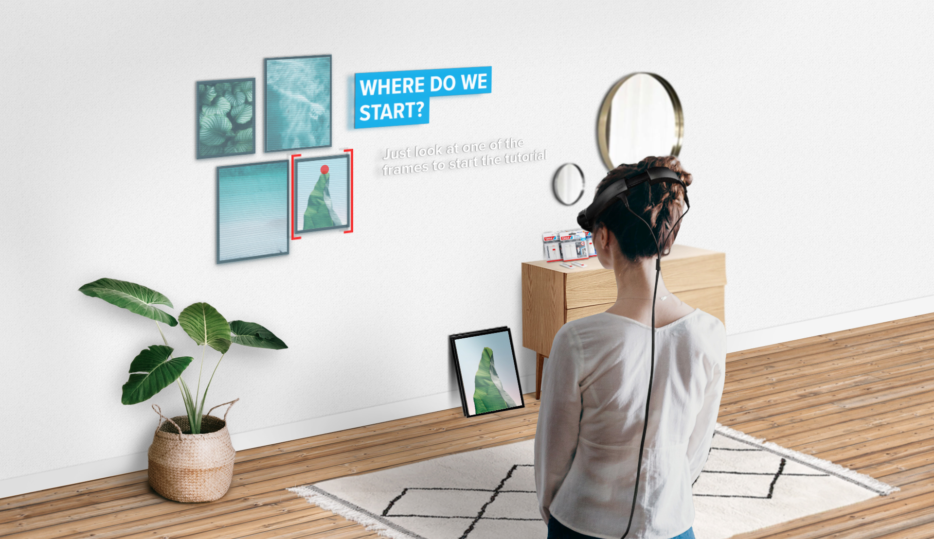
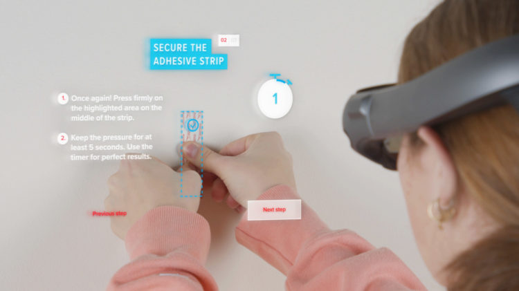
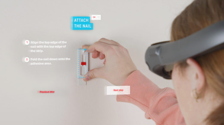
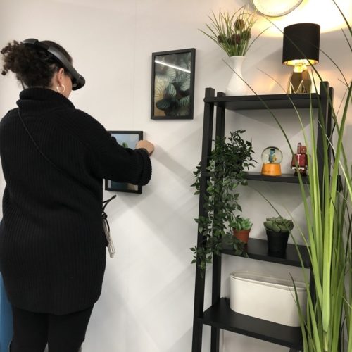
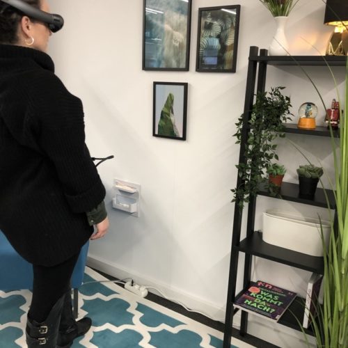
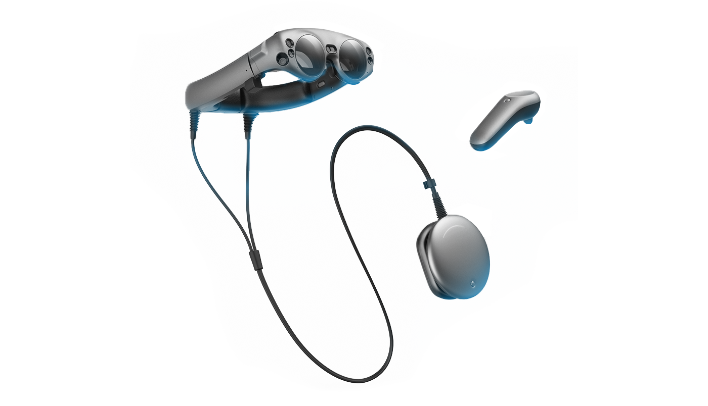
AR Glasses like the Magic Leap bring digital content directly before the user's eyes and, at the same time, create space for interaction in reality - the next level of augmented reality. And what is even more important: compared to smartphone AR applications, users have both hands free with AR glasses, without the controllers they can rely on gaze control. The experience begins with the user seeing a personalised proposal for their picture arrangement. They then are told in detail how they can achieve it themselves: with detailed AR directions and augmented frame guidelines appearing before them. The application ends with instructions on how to correctly mount your pictures onto the tesa Adhesive Nail – supported with hook indicators so you can place your frame on it successfully. And there are two ways to do this. A step-by-step guide for beginners and a quick guide (with fewer steps and details) for experienced users.
Creating a design language for a mixed reality future
In terms of design, we were in uncharted territory. Web design guidelines were readily available, but there was nothing about how this would translate into AR. We knew we had to work with a limited field of view, due to the current vision parameters for the Magic Leap, while still making it look good. We also had to make further adjustments to the colours as they appeared lighter through the semi-transparent glasses – the color black, for example, cannot be displayed and appears as transparent. Since we operate in a 3D environment a third axis – the "Z" axis –was added. This allowed us to place important UI elements like call to actions at the front, and elements with less priority at the back.
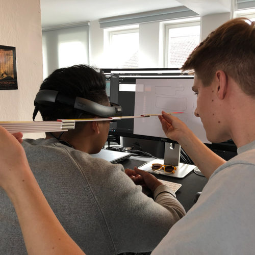
One fun fact: to quickly prototype new ideas and directions, we continually paper-prototyped the AR elements using a blank white piece of A3 paper, 60 centimeters from the user's eyes: since we worked out that's almost precisely the viewport of the AR glasses.
Development: Pushing the Magic Leap to its limits
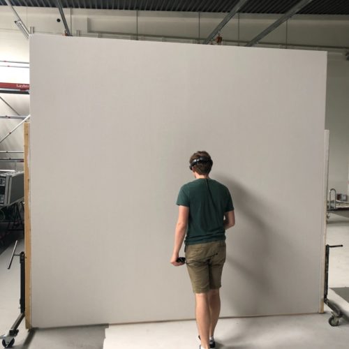
One of the first steps in our process was to evaluate which AR headset was suitable. At the time the magic leap had the best field of view (which it dynamically adjusts content to), processing power, and a lightweight form factor, thanks to having a separate processing unit. Tracking a white wall is the hardest part of AR, and we soon found out the Magic Leap has one of the best, although not perfect tracking techniques available. This device allowed us to bring precision down to only 5mm variance in between sessions. The app itself was developed in the Unity game engine. Building upon our experience with Magic Leap and Unity, we found out we could easily reuse our newly developed UI and logic on other technology too – like projection-mapping, mobile AR or even VR – thanks to the flexibility of Unity as a platform.
Potential for something bigger
The final prototype proved that the AR application was well within the realms of possible. But the decision whether to move forward or not is complex. We completed with a comprehensive evaluation of our learnings and their future business case. With this process we showed once again, that it’s the brands that prototype today, that will be a step ahead of the market tomorrow.
