Creative Agency
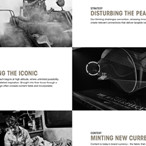
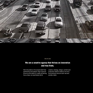
We created the new website of US-based creative agency OPTIMIST. They accel at creating immersive, highly audiovisual event storytelling. We used strong video content, combined with a clean and fully responsive design to communicate their philosophy and work.
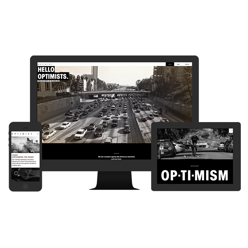
The best experience for all devices
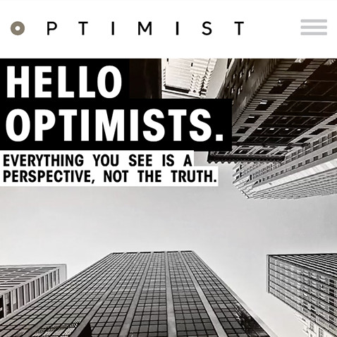
We tried to create a fully responsive experience, that was also optimized adaptively for three main devices classes. While we used full-width video backgrounds for the desktop, we focused some mobile use cases on phones and tablets.
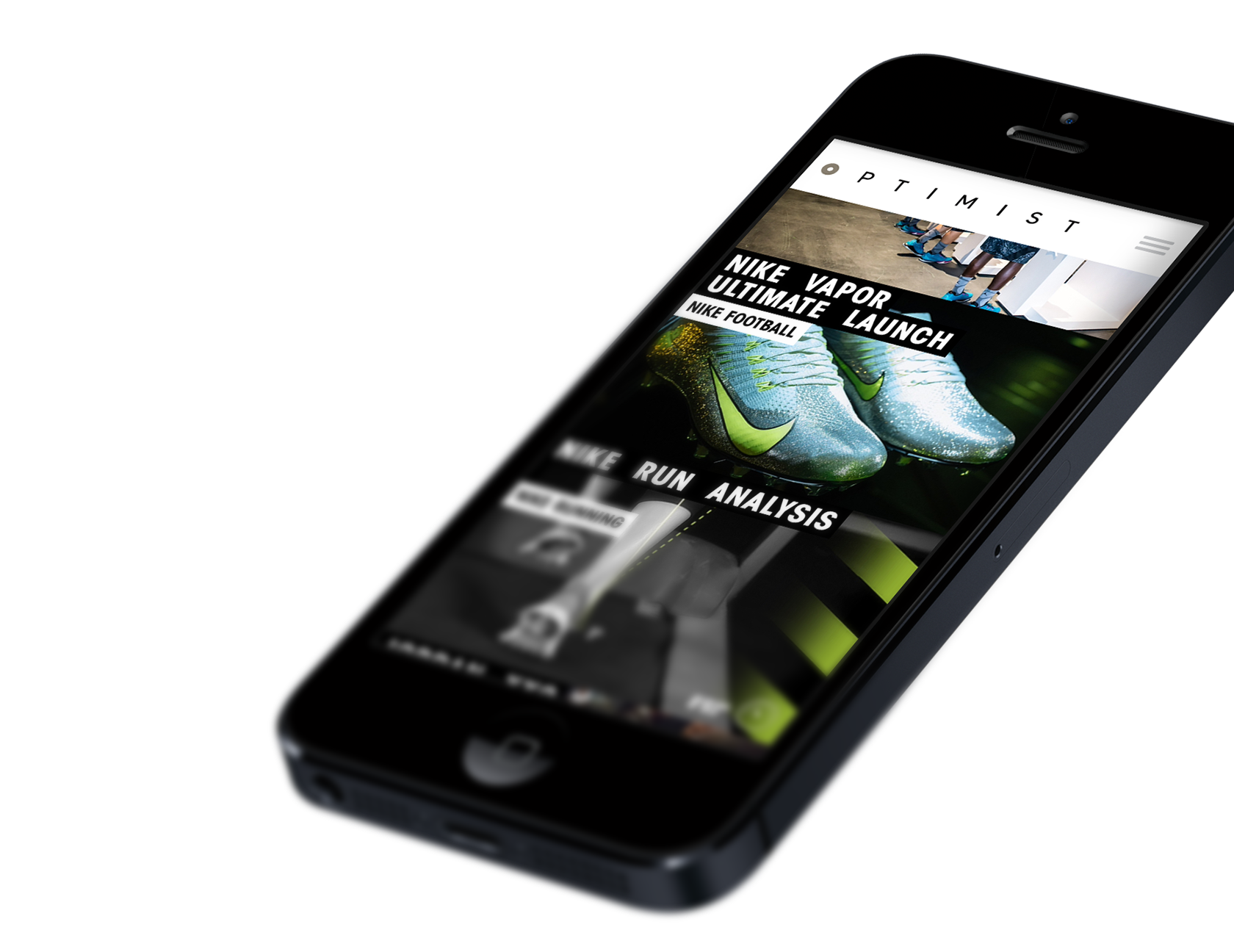
Showcasing all the projects
A central aspect of the website are the portolfio cases of OPTIMIST. Highly visual in nature, the events of OPTIMIST are best portrayed through video and images with impact.
Video backgrounds for the desktop
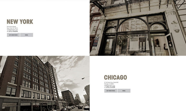
The edge-to-edge design of the site shines on desktop with beautifully produced full-width video backgrounds, which illustrate the local color of the four major US cities OPTIMIST is currently operating from.
Adaptions for mobile use cases
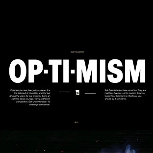
We like responsive layouts, because the provide a flexible and easy to maintain structure for desktop and mobile devices. But, we are also big fans in overriding some of the responsiveness with adaptive changes, to more fully reflect the intrinsic use cases of different devices. Especially for the phone classes we added some little details, like location-based features or direct calling.
A clean and precise layout
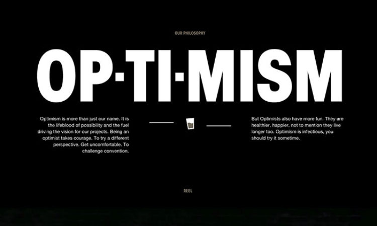
In simple, yet elegant, layouts such as this, one of the main concerns is spacing. Throughout the design and development of the site we made sure we to great care with the vertical flow of elements. The big, expressive headlines provide information as well as being a stylistic element, that we used sparingly for full effect.

