The 2013 Relaunch
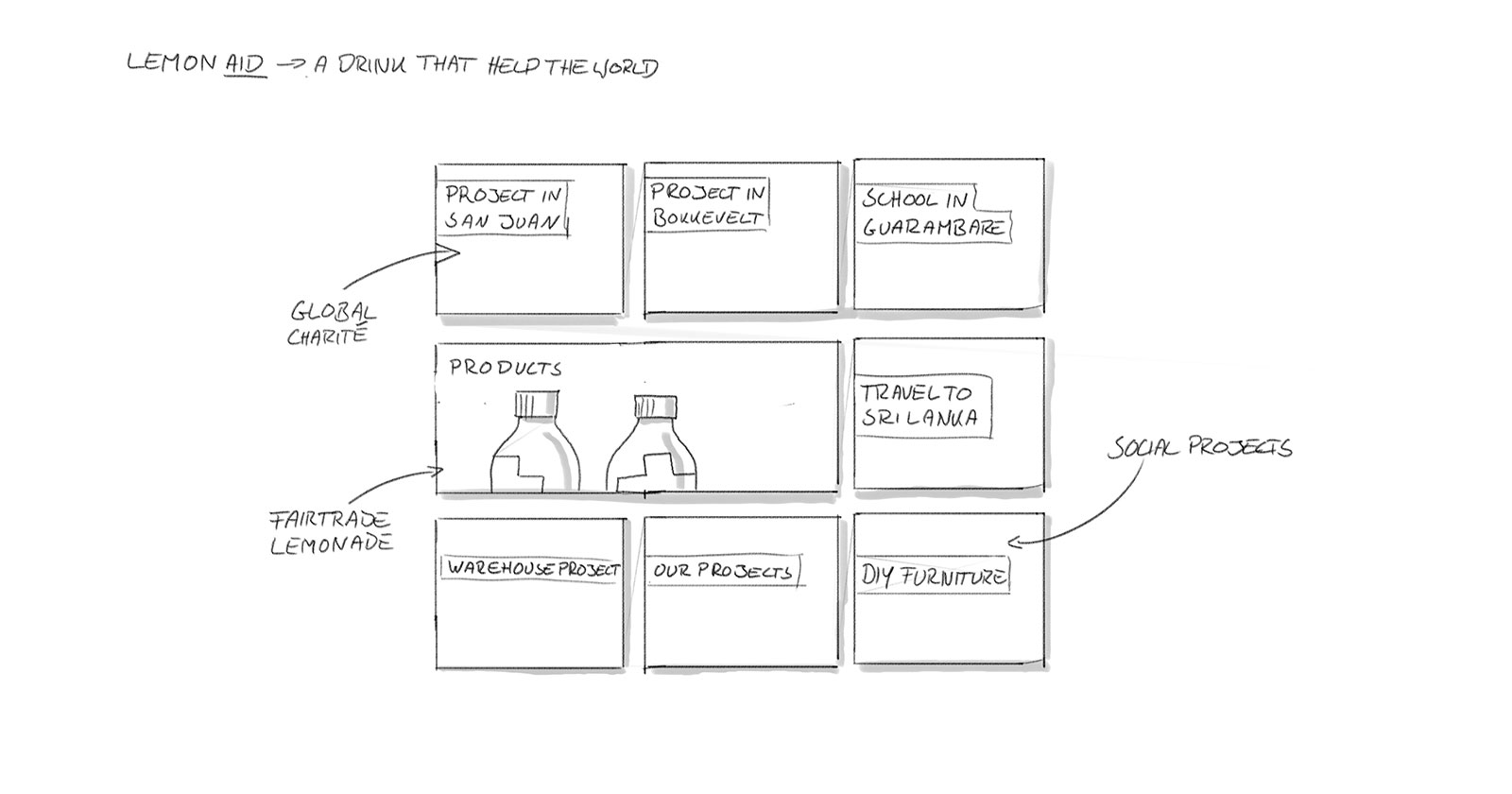
After creating the website for Lemonaid in 2010, it was time for a relaunch of the site in 2013. Our focus was to put the spotlight on the brand’s social commitment. For this we first developed an optimised information architecture, before tackling the design of the new homepage. The result is a responsive website, which communicates the brand, as well as the mission statement and the social commitment of Lemonaid in a modern way.
Drinking helps
Our task was to highlight the company’s commitment and charitable projects. A social aspect was therefore at the focus of the brand and product communication. It was also necessary to integrate all existing Lemonaid channels, which transform the website into a real hub.
The attention of the community
Lemonaid is not only synonymous with refreshing lemonades, the brand stands for an entire movement that advocates social responsibility. Which is why, in addition to the products, there are a lot of projects and campaigns which Lemonaid supports, thereby presenting itself as a sustainable brand.
Bringing the contents to the fore
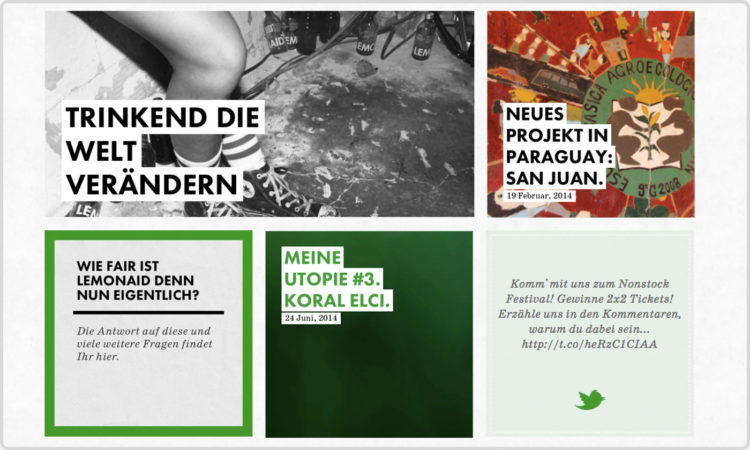
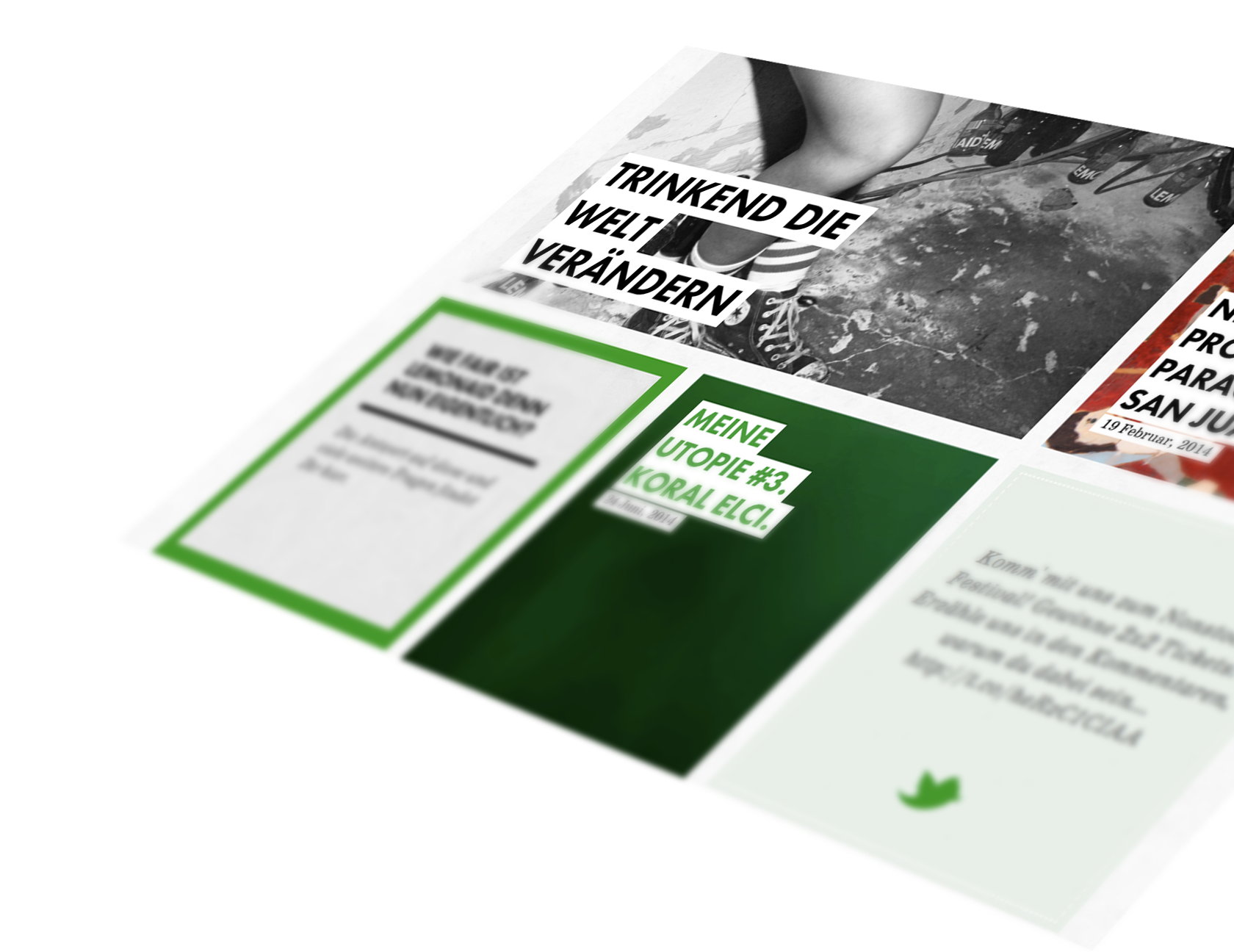
To ensure the social projects find the space they deserve in the layout of the website, a blog section automatically fills up the design grid with its entries. This not only makes updating the website very simple, but through their presence the projects define the appearance of the site.
Authentic design experience
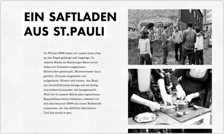
By highlighting the contents and projects in the design of the website the classic product communication takes more of a back seat. The true nature of the brand comes to the fore – including the community and the consumers. This results in an integral image of the brand.
Responsive website
The simple layout structure helps us in that the website looks just as good on all devices and that no major compromises have to be made on any device. The result is a fully responsive website.
Mobile view
In the case of smaller resolutions, all of the layout’s modules are arranged below one another. This means that the contents are legible and retain the same look and feel.
Handmade
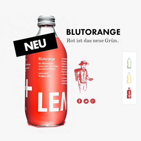
Just like the drink itself, when it came to the details we ensured that a lot of the elements were handmade. Whether in the icons, the descriptive graphics or some of the images.
