USA Trips for Bikers
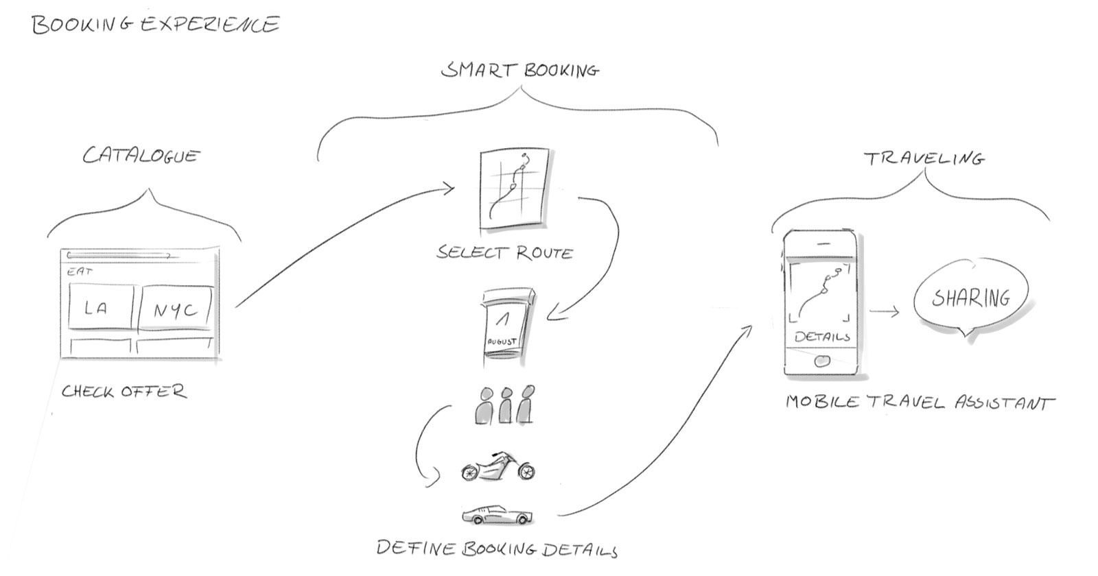
Eagle Adventure Tours – a provider of premium trips to the USA – commissioned us with the design of their new website. We created a travel booking concept that conveys the appeal of independent, tailor-made trips right from the very first second and ensures an emotional user experience.
Get your kicks
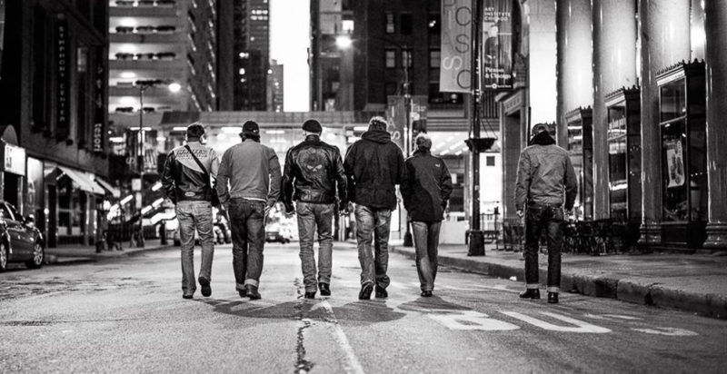
Right from the outset our goal was to create a tourist website that goes beyond the approach of traditional travel agencies. In keeping with the target group we wanted to give the booking experience a new and expressive style – one that fully immerses the customer into the world of the brand, meaning that their adventure can begin with the booking itself.
Authentic and modern
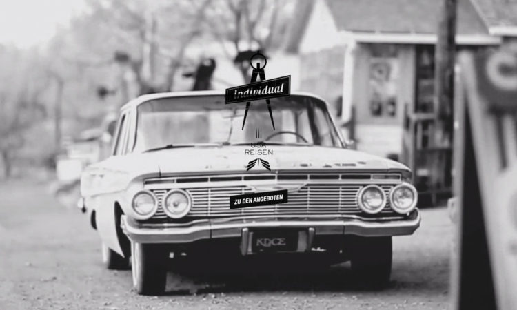
Our plan was for the design to impress with its transparency and authenticity and to speak the language of the target group. We combined the visual imagery of 1950s America with modern user navigation and a contemporary multimedia presentation.
Clearly structured
Every customer can individually tailor their trip to suit them. During our brainstorming session we came to the conclusion that our focus should be on providing an excellent service to the user. And this can be achieved with short texts that are easy to understand and that explain the booking process step by step.
A visual experience
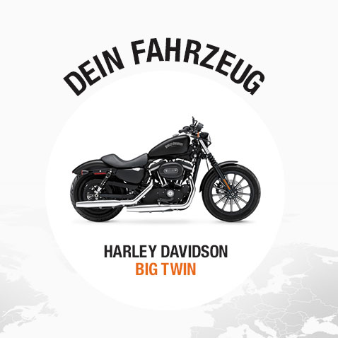
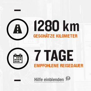
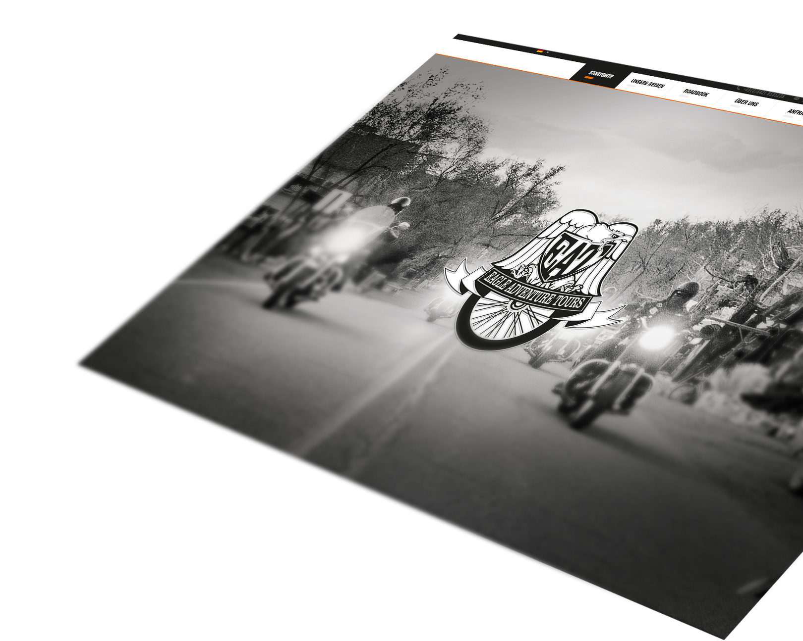
We integrated unique film and image material that illustrates the selected trip and appeals to the user’s sense of adventure. We also developed our own icons to navigate the user through the booking.
The virtual pillion rider
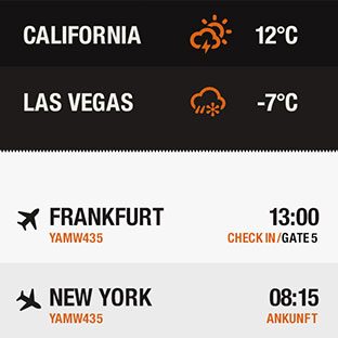
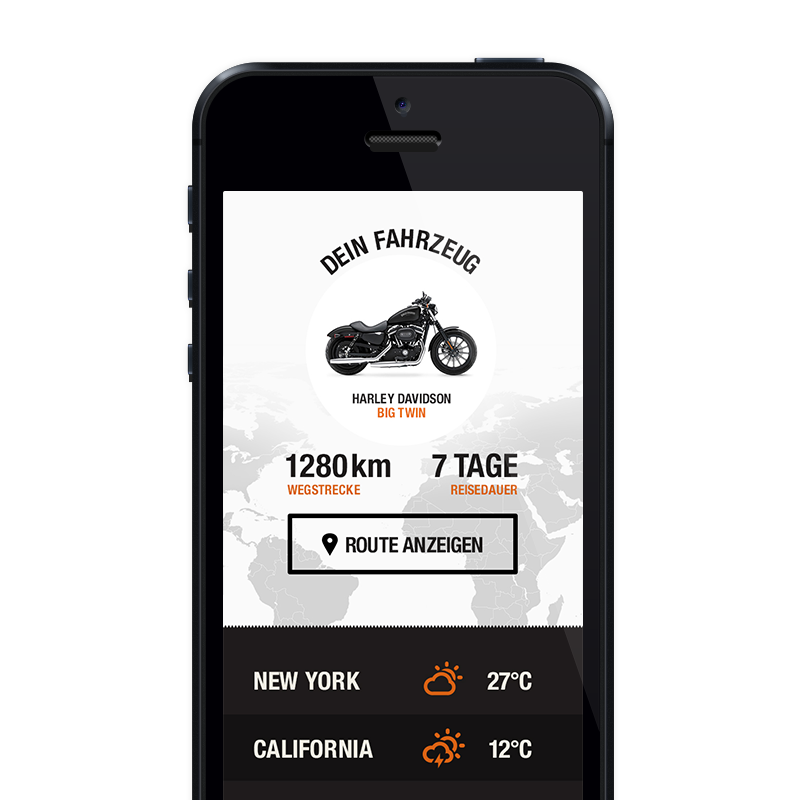
So that Eagle Adventure Tours can also continue to provide individual support to its customers after they have made their booking, we developed a little CRM tool. For every traveller the tool creates their own virtual travel companion in the form of a mobile-optimised microsite. Not only are all travel documents pooled on this microsite, the companion also helps with services and contact options during the trip.
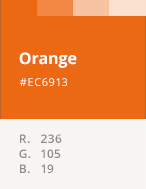
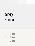
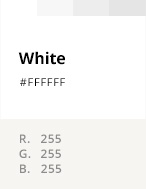
Color Palette
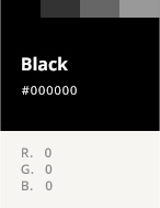
Black and orange. It’s no coincidence that these colours became part of the design.
The visual language
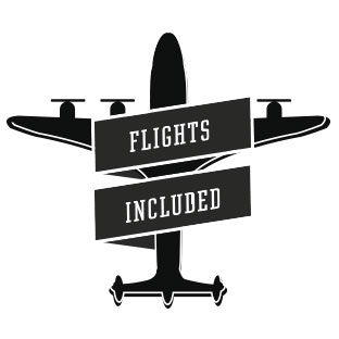
We achieved the individual look of the website not only though the images. We also developed our own graphic language, which works with icons and 50s-style symbols. This acts as a counterbalance to the photo-dominated layouts and defines the overall appearance.
