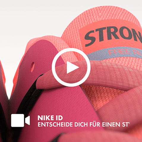
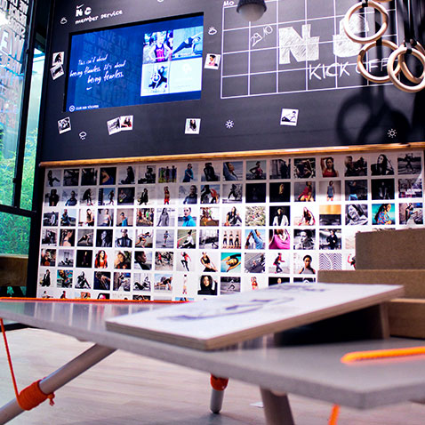
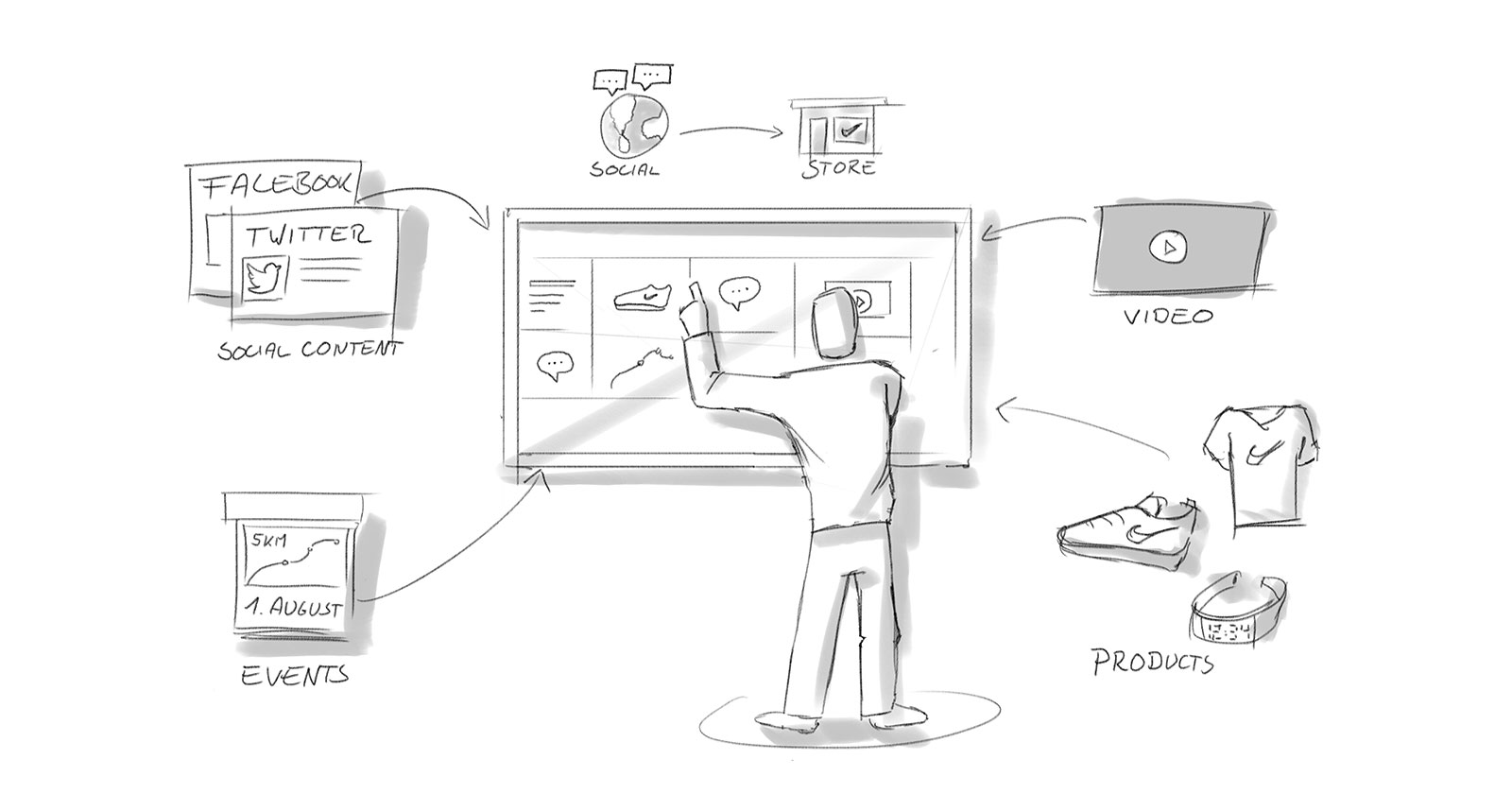
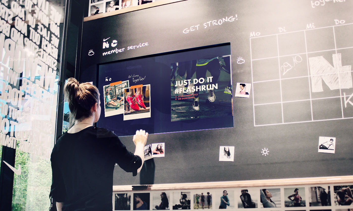
Social Community Wall
An interactive in-store application that offers customers the opportunity to immerse themselves in the Nike product world and to be inspired by the sports-enthusiastic Nike community. Our aim for the “Community Wall” was to highlight the connection with the brand and increase its identification power. This has a positive influence on the purchasing decisions of the customers.
New interaction
The first application was a planned integral part of a new Nike brand area within the SportScheck store in Munich. Several factors had to be taken into consideration in the concept development of the application: How can we get the customers to become involved in the first place? How should the application be built so that the contents can be found? And how can we ensure that the spotlight is not only on “advertising”, but also that relevant information is offered?
Design based on social context
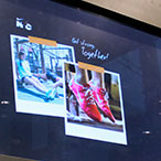
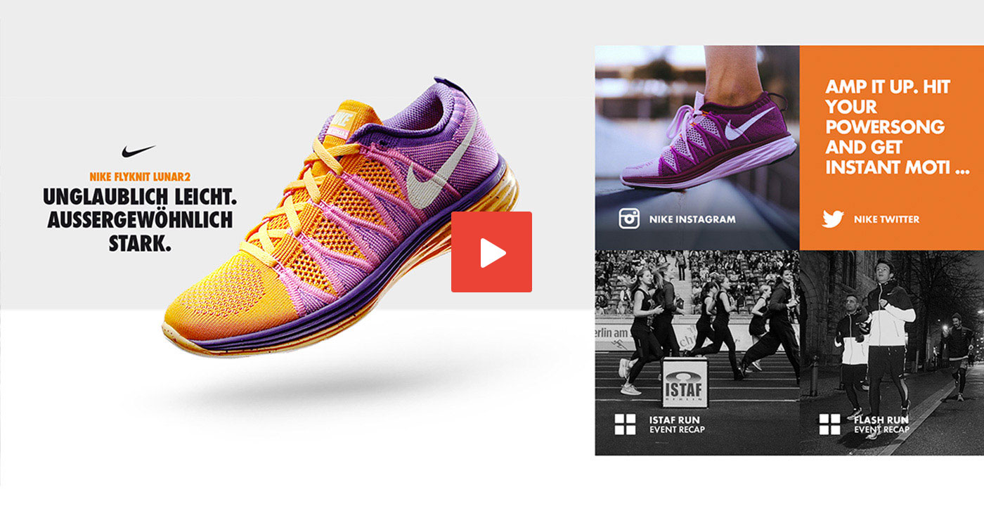
As products these days are more than the sum of their materials, we decided to address this task using “social context communication”. This means that via the wall, information about running communities, brand events, fashion outfits etc. is offered in addition to the products. The potential buyer is given a new perspective of the products and can base their purchasing decisions on their own needs. This raises the product communication to a higher level and offers a glimpse into the sales world of tomorrow.
Permanent networking
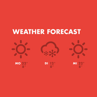
As the touchscreen application is connected to the internet, the app can access current information from the relevant interfaces. So not only does the app display real-time content from sport communities, but it can respond to changing conditions depending on the situation – such as the weather.
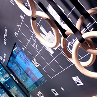
Nike Community Wall
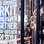
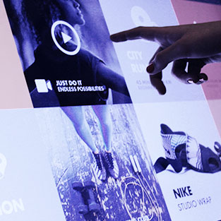
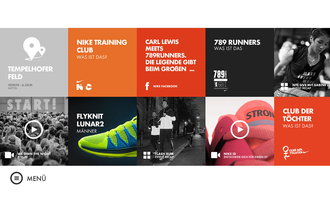
The intention of the concept is to offer the right mix of product information, entertaining films and information from various communities. Equipped with a flat navigation, it still leaves enough room to discover the multi-layered contents in a way that is enjoyable. The clear design grid helps the user to understand the navigation structure intuitively, thereby lowering the customer’s inhibitions when it comes to interacting on the shop floor.
In-store touchscreen
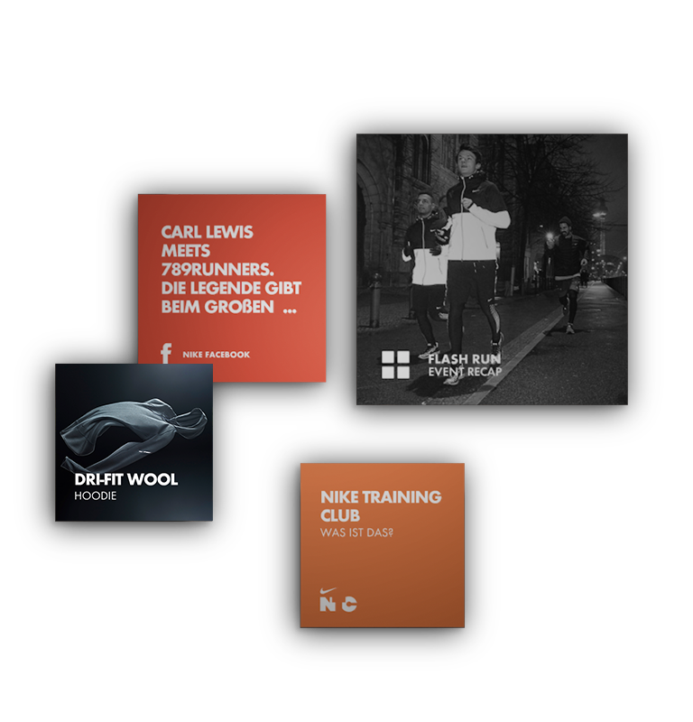
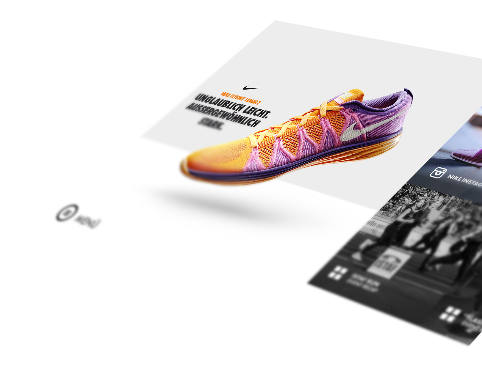
The application architecture is made up of several layers. A separate menu helps the user to explore the different areas of the Community Wall. This includes exercises, running group, product highlights and also topics specific to individual locations. The contents are available in full-screen view, in tile groups and as an individual graphic of each product. So the customer is just one touch away from the content they’re looking for.
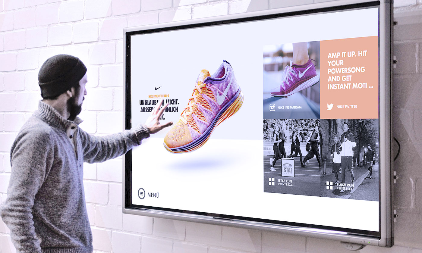
Colourful new world
We developed a separate colour concept for the application. The subpages and the typography are largely in neutral colours, while vibrant colours were used for the individual tiles in the grid. By changing these highlight colours we can modify the entire look of the application very quickly – whether through individual adjustments within a store or through new collections.
Reduction
As the Community Wall is in constant motion, we decided to keep the language as simple as possible so the customer can understand the information at first glance. We focused on short and catchy headings and created different icons, in order to visually differentiate the tiles.