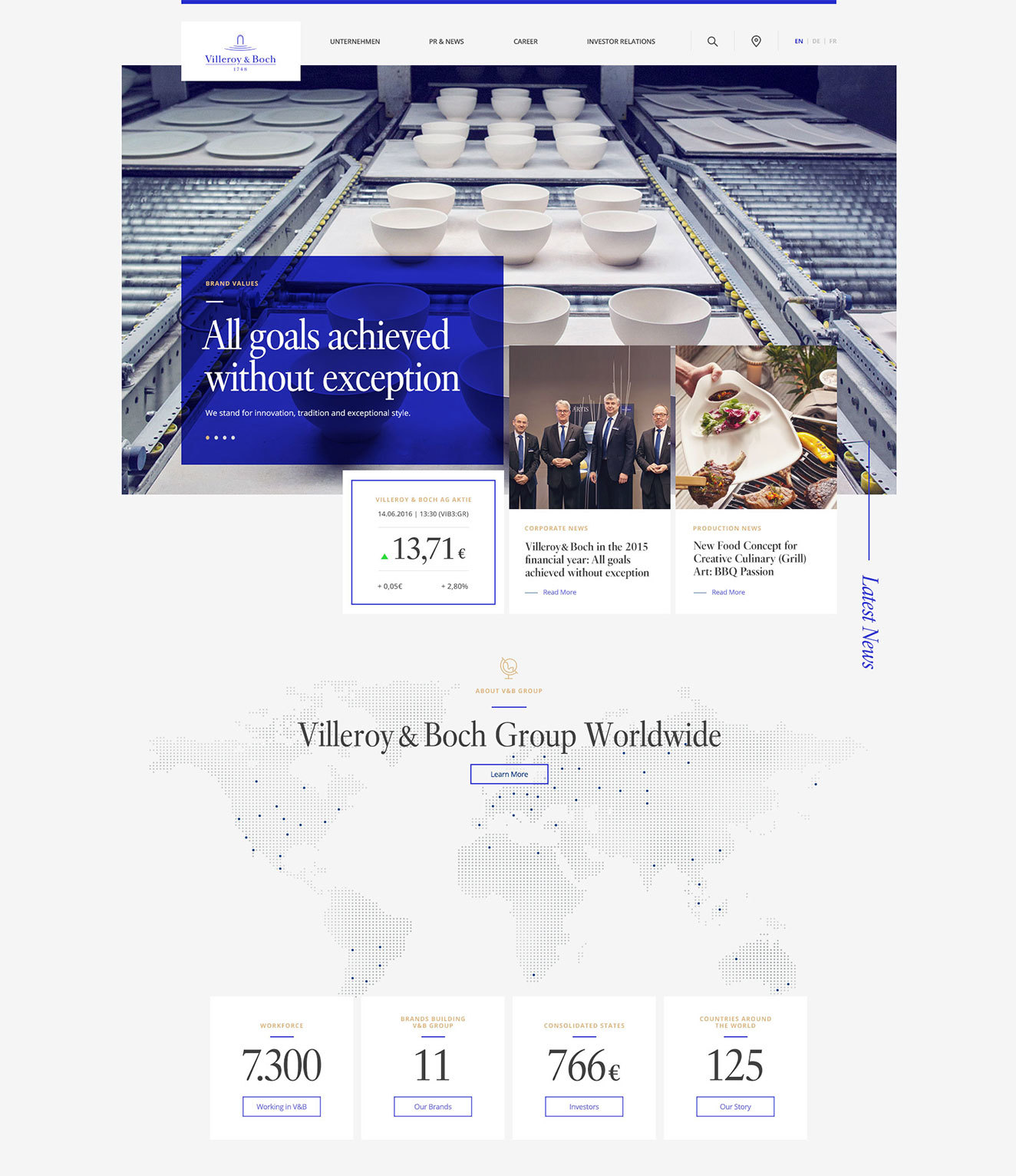
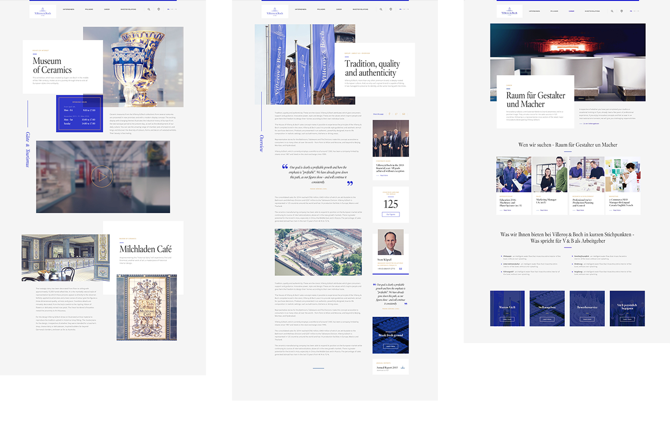
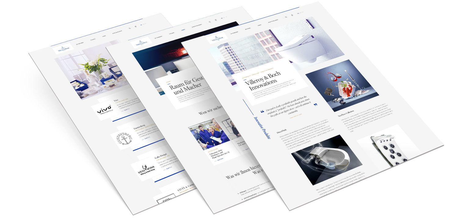
Redesign of a global brand
With the redesign of the Villeroy & Boch corporate website we provided the brand with a more modern and contemporary corporate communication. Our work included the creation of a responsive design, the reorganisation of the information architecture, as well as the technical implementation of the front-end.
Tradition meets modernity
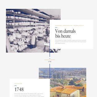
Villeroy & Boch is a company with more than 250 years of tradition. Today the ceramics manufacturer is a highly modern and globally operating business. A company with such a long tradition needs to reinvent itself from time to time so we supported Villeroy & Boch with the adaptation of their digital image, creating a more modern and appropriate look and feel.
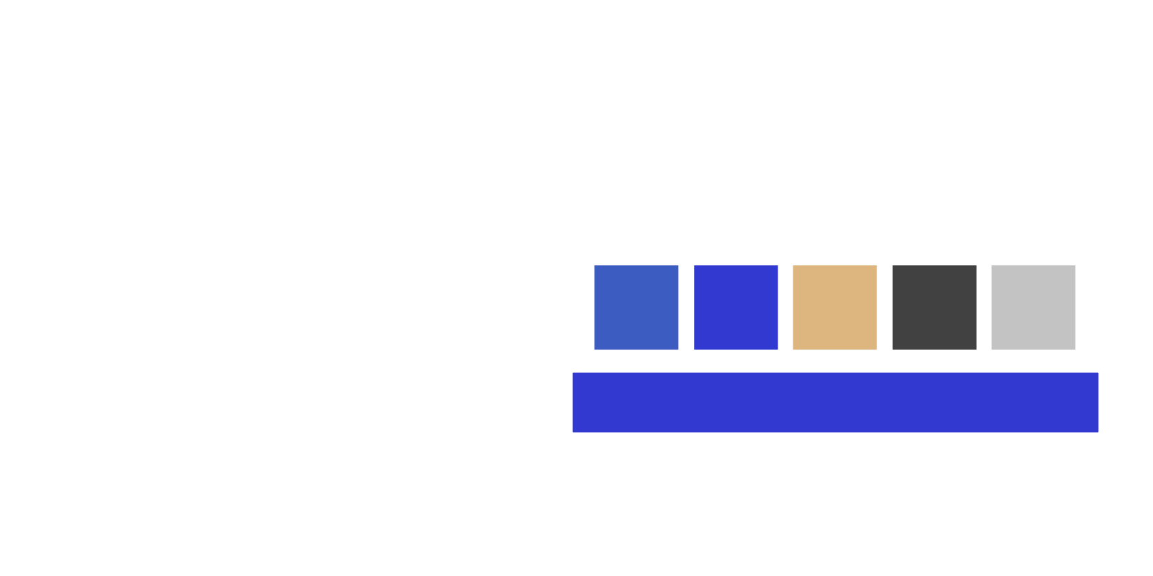
Refreshing the basics
For a holistic and noticeable change, we looked at all components of the corporate design and reinterpreted them. This included the typography, color scheme and look and feel of the visual world, as well as the design grid.
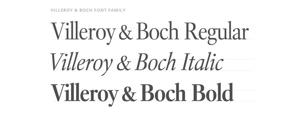
Using the house font
Villeroy & Boch has its own font which has a very unique and classic appearance. The font needs to be used prominently to attract attention. Therefore all font weights are used in the new design.
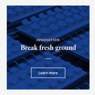
New visual imagery
In keeping with the new color palette and to make the new colors really stand out, we developed new guidelines for the corporate imagery, which set out the creative theme for the presentation of the brand’s products, people and production facility.

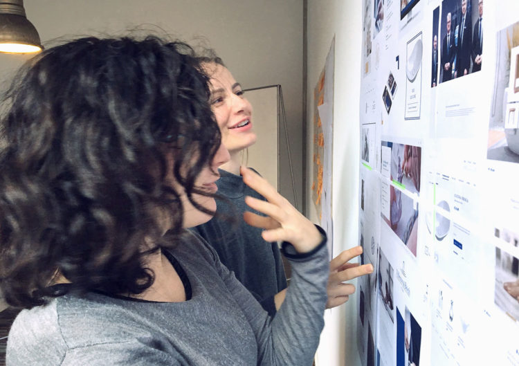
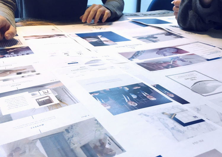
Creation process
Before developing final layouts, we create a bigger picture for the design. This can be within the team, with or without our clients. Together we collect pictures, layouts or other objects and ideas and bring them together with the brand’s product and design world. From the resulting mood board, we plan the next steps.

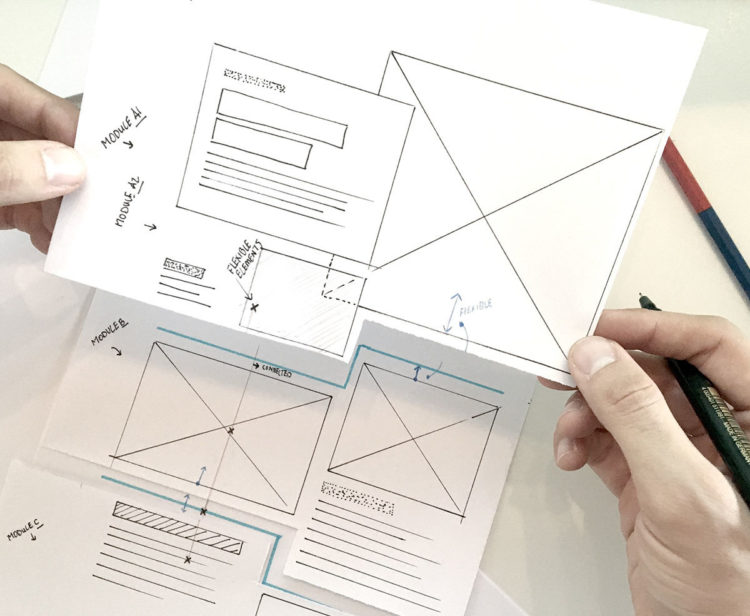
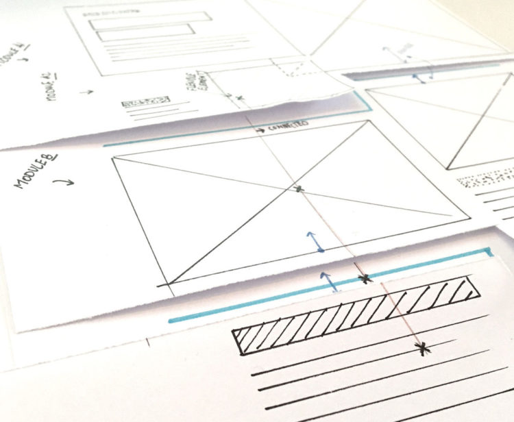
Preventing boredom
Within the content grid, all modules mesh with each other to break up the structure of the website and prevent a box and box structure.
The result
New colors, a confident use of typography, the use of a consistent corporate imagery and the bold and individual design grid present the company digitally and in keeping with the position of the global brand, which is synonymous with quality, efficiency and innovation.
Details matter
The ideas of the redesign were integrated into almost all modules: the use of colorful surfaces, thin lines, the golden color and the relaxed use of the corporate font.